Lorry Sticker Designs That Read Clearly from Afar
Name, service and contact, written big with high contrast. A practical guide to lorry sticker designs that read on the road.
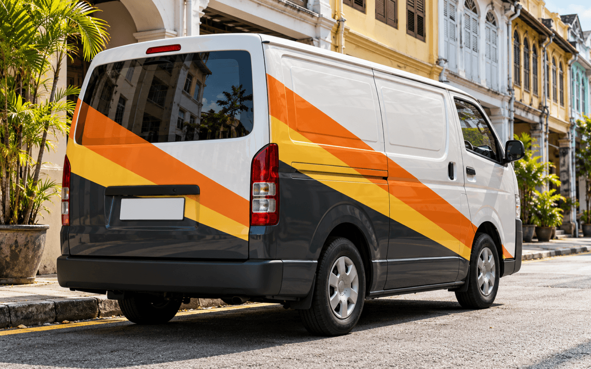
A beautiful lorry sticker is useless if nobody can read it from a distance. Other drivers have only a few seconds to catch your name and service before your lorry passes. This article shares the principles of a lorry sticker design that reads from afar: what to write, letter size, colour and contrast.
Start with just three things
The most common mistake is wanting to put everything on. A lorry is not a brochure. People who see your lorry on the road need to know three things: who you are, what you do, and how to reach you.
Information hierarchy
- Company or brand name — the largest element.
- Main service — one short line, for example "Frozen Goods Delivery".
- How to reach you — a phone or WhatsApp number, big enough to read from the car behind.
Other details such as a full address, email or a long list of services can be trimmed or dropped. Every extra item takes space away from the three that matter.
Write the service in your customer's words
Use the words your customers actually use when they look for the service. "3-Tonne Lorry Rental" is clearer than a clever but vague slogan. A slogan can stay, but put it under the name, not in place of the service.
Letter size and font choice
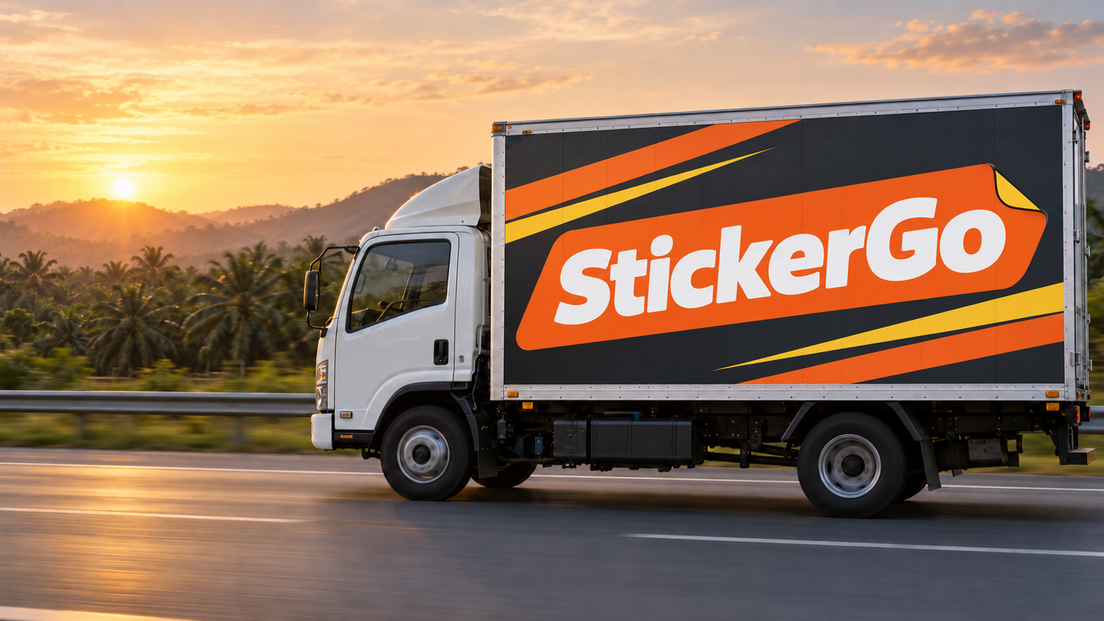
Big, bold letters are your friend. The lorry is moving, other drivers are moving, so thin or script text easily turns into a blur.
Choose a strong font
A bold sans-serif font is usually the easiest to read from far. Avoid curly handwriting fonts, very thin letters, and all-caps for long lines. One or two typefaces are enough for the whole lorry.
Space between letters and lines
Text that is too tight merges into one shape from a distance. Give enough space between letters, between lines and around each block of text. Empty space is not waste; it is what makes your text stand out.
A simple test at home
Print your design on an A4 sheet, tape it to a wall and step back a few paces. If the name and number are still clear, you are on track. If you need to squint, the text is too small or too tight.
The right colour and contrast
Contrast is the difference between the text colour and the background colour. High contrast keeps text readable; low contrast makes text vanish, especially in rain, at dusk or when the lorry is dusty.
Safe combinations
- Dark text on a white or yellow background.
- White text on navy, black or charcoal.
- One bright colour as an accent, not five.
Combinations to avoid
Red on green, yellow on white, or dark blue on black may look good on screen but are hard to read on the road. A busy photo behind the text also ruins contrast. If you want a photo, place the text on a solid colour band.
Stay with your brand colours
If you already have brand colours, we use them and arrange them so contrast stays high. Your lorry should look like part of your brand, the same as your shop, business card and website.
Layout that follows the lorry's shape
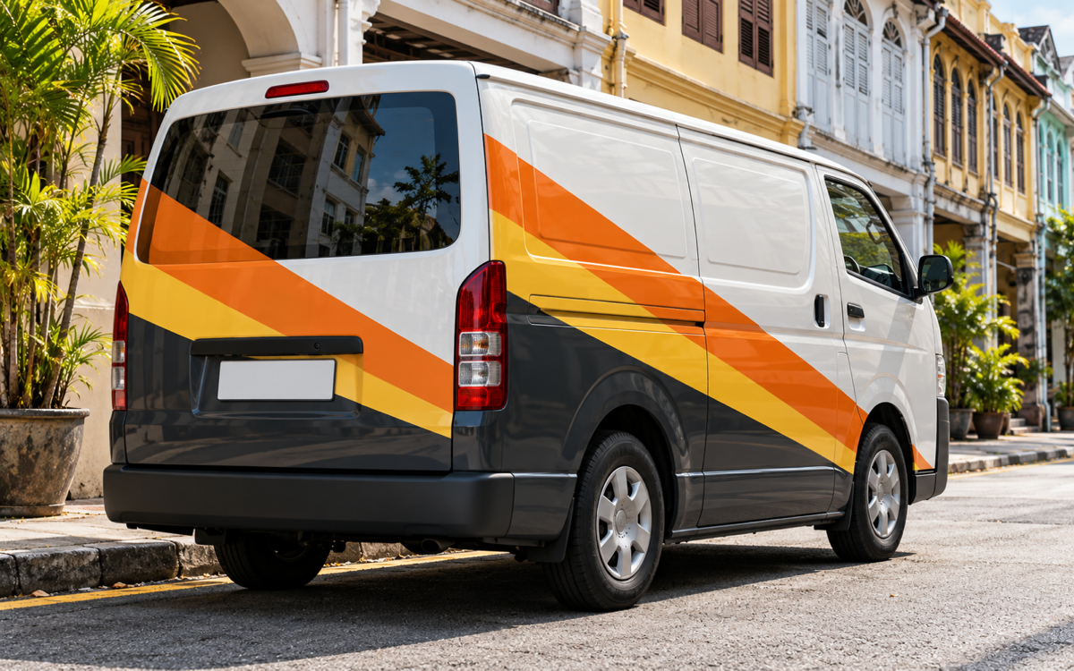
Every lorry has doors, hinges, corners, rivets and fuel tanks. A good design takes all of these into account so the company name isn't cut by a door or hidden behind a step.
Sides, rear and doors
The sides suit the big name and services. The rear is seen longest by cars behind, especially in traffic jams, so a phone number on the rear is very useful. Cab doors suit a smaller logo and name.
That is why a clear photo of the lorry matters before we start designing. Follow our guide on how to photograph your lorry so we can see every panel.
A checklist before the design goes to print
Before a design is approved for printing, check these points with us. It is far easier to fix a file than to fix vinyl that has already been printed.
- The company name, services and phone number are spelt correctly.
- The company name is the largest element and isn't cut by a door.
- The phone number is on the rear of the lorry, not only the sides.
- No key text sits over hinges, rivets or corners.
- Text and background colours have high contrast.
Reviewing the design with us
The design and price are checked together on WhatsApp before we start printing. This is the best moment to ask for small changes, such as a bigger number or a different order of services.
Materials that help readability
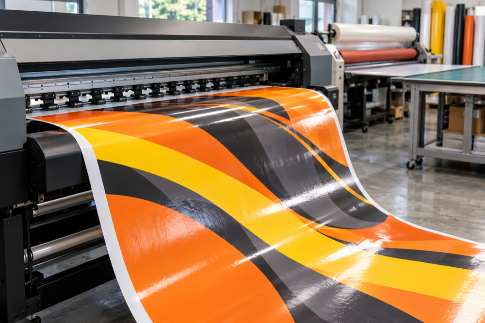
Besides design, materials help too. Reflective sticker makes a name or number show up in headlights at night. Die-cut letters give text sharp edges with no background. Prices for these optional materials are confirmed on WhatsApp. See lorry sticker materials for what each one does.
Design is part of the package
Professional design is included in the Standard (from RM2,200 per lorry) and Size XL (from RM3,500 per lorry) packages. You can also bring your own design file. Details are in the packages section. Installation at your location is available in every state, for example in Seremban or George Town.
An effective lorry sticker design starts with three things: name, service and contact, written big with high contrast and laid out to suit the lorry. Send us your lorry photo and logo, and we will propose a design that reads clearly from a distance.